Yay!! You have a new Project! – let’s say you are designing a professional website, a personal blog site or portfolio to an E-commerce website, the first most important step is not choosing a Platform to work on, not a tool or a language, but it’s the User Interface / Experience Design.
The thoughts in this post are based on some basic UI/UX design principles and lots ofresearch into how users actually work with websites. I’ve been designing and developing websites for organizations and startups, helping them create sites and blogs that people love to visit, read and visit again to know more. That’s my background. I have tried to compile a brief list of few design principle which I use as a foundation base to all my User Interfaces. So, let’s get started!
Fundamental 1: Know your audience
Before even deciding on the Platform, tools, text and pictures to use for building a site, we need to know our audience, who we care about and to whom we need to share the data on our site. I always dedicate and spend some time thinking about who is the larger audience the website will be catered to. Thereby, I start with sketching out the 4 most important aspects – which is called as Sketching a Persona.

it’s important to enlist the attributes of our visitors, what their values are, what their goals are and what concerns could stop them from using your site.
Fundamental 2: What, where, when and how of User’s way of interaction?
Next, it is important to understand how people interact with webpages, what makes a good Web User Experience. How people browse the web, Where do they look for the information, what they like to read, how they like to read, when do they choose to stay and explore more or hit the back button. In a nutshell, what motivates them to know more about our site and how to provide user the information they are looking for in a short span of time which I call the motivation!
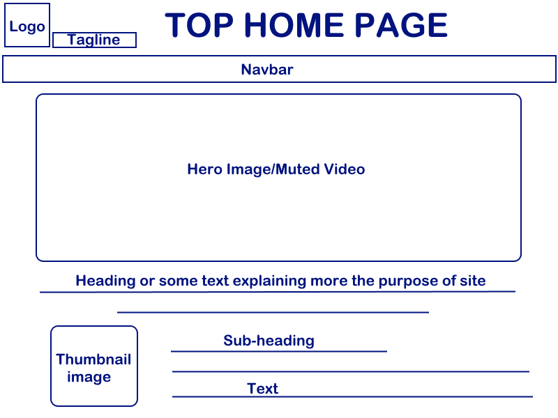
The Main/Home Page has to show the clear sight Tagline. It’s about how quickly you orient your user’s mind with your message. While describing what the purpose of the site is, it is a good idea to use plain language instead of Technical jargon, which your users might not even understand.
I totally agree, it’s hard to cut short on content when we want our users to know completely what our site does and what services we offer. But at the same time we don’t want to distract our users with too much data which they cannot absorb in such a short attention span. It is sure they won’t stay long enough on our site, if they are confused or bored. That is what calls for Headings, sub-headings, thumbnail images to efficiently pass our message to the user. So, it is time to think of the term – Declutter. Keeping it neat, simple does not mean boring, but if there is too much content, it doesn’t help either, moreover it can be harming! Images are good friends. Careful selection of genuine images should help explain the content keeping the textual elements concise.
Keeping the design and Page behavior consistent is another important aspect when I think from the user’s perspective. Consistent means having the same response whenever they do some action. It could be an On-click event where the user clicks on a link to further open up a new light-box, a modal window or a new page.
Fundamental 3: Keep it Standard and SEO friendly
Standard design does not mean old or boring, but means what users appreciate and why they choose to stay longer on some sites. There are few advantages in going standard – visitors might not be too much technically oriented that they would spend time on understanding how a new jQuery feature works on our new site!
A confused user is a lost user. Few features which are standards, expected by all users as they are aware of are – Light-boxes, Carousels, hyperlinks, Video controls, Hover & Focus and some more.
A standard consistent navigation which helps the user find information is vital. If that helps visitors situate them on our site, they might want to check out more pages. The drop-downs and fly-out menus which are not coded properly can sometimes be really hard to click on, they keep disappearing and as a result they are very frustrating. It is a standard which states that menu should be no longer than seven items. This rule comes from research into human memory. It’s tough for a visitor to wrap their head around for more than 7 navigation items.
It’s that time now when even children assume that underlined text with a “hand sign” is sure to be a hyperlink. Make sure the visited links change color, this lets users know if they have already been on our website. Using in-page links when there is too much content is again a good option. Not confusing the user to where the page goes: always name links as the text-information they provide instead of “Click here”.
When you have a rich hierarchical content, the secondary navigation scheme comes good in use. I have used them in past and I think Breadcrumbs are a good way to let the users trace the path where they came from and explore more.
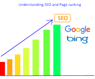
Further moving on to the search engine’s friendly content: There used to be days when stuffing keywords was a way to help Search engines crawl our site data and pull in search results. But, alas! gone are the days and the way it works now is absolutely different. Search engines are way faster and smarter now.
I think a website which does not pull up in search results when looked up for is no more than a dust laden piece of art. Therefore it is imperative for the site-pages to be searchable when the users try to find it.
The pages should have all common elements : a short write-up about what your site is all about is the focus. A tagline directly under the site logo or name provides a better understanding to the goal of the site. Make sure the tagline appears on pages as text not graphics, because search engines cannot actually read the text from within an image and that would waste all your time and hard work you put in an effort to optimize for search engines. Site logo, tagline should all be hyperlinked to your home page. This action has now become a standard way of doing things.

The Home page or the landing page should focus on its core topic. After reading this content, visitors should have the answers they need and be ready to move on to the place where the information lives.
Fundamental 4: Content Layout
You just have 5 seconds to capture the user’s attention! How would you do that! Well, this is the wise approach – always remember the users SCAN rather than reading, and their concentration lapses as they get further down the page.
So make sure you use plenty of headings, subheadings, images to pass the message and to help them scan through the page to the path they need.
There could be many approaches we can decide to layout the content with. I am discussing the 3 main which usually I follow on different websites keeping in mind their content size. It could be Linear, Sequential or Splitting Pages. The important thing is to consistency between different pages of the same type.
More than ever before, now when we all have switched to thumb scrolls on phone, scroll wheels on mice and easy swiping on touch screen devices have made it so that almost all visitors to our site are likely to be able to scroll down through your content laid out in a Linear approach.
At the same time, If the information we have as sequential, for example an article, a blog, a story, a photo gallery, or an instruction guide with step-by-step instructions, then a Sequential approach makes sense. What we’ll need for Sequential pages is a descriptive heading on the first page and then headings on subsequent pages that makes it clear that they’re a continuation of the article.
Let’s see the Splitting approach – here we split our content topic wise by level of detail. It works best for the content that people want to read in their own order and where we are not aware of the level of knowledge that they are starting their research with.
I also find In-Page links useful to let people quickly jump to more information of the content they might be interested in.
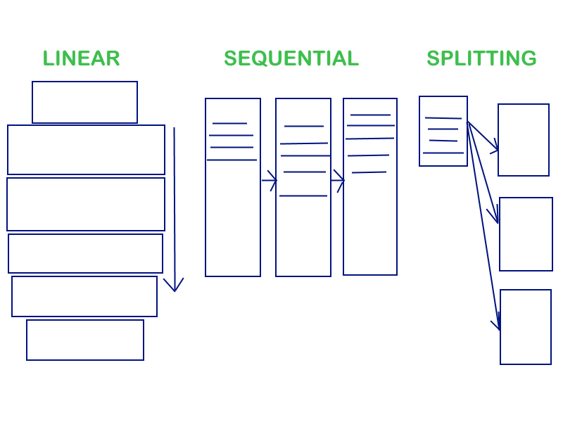 We can make some pages Linear, some Sequential, and some Split. The important thing is to make sure we have consistency between different pages of the same type so that the user does not feel lost or out of context.
Fundamental 5: User’s Reading Pattern and what they like to share
This is such an important insight that there is a particular pattern of how people read on web. Again, before deciding on the pattern to go with, always consider arranging it as per the user’s preferred way of scanning the web.
Using Eye Tracking Technology, we can see where people look on the page. User’s gaze follows a kind of F pattern on the page, moving across the page near the top, and then moving down the left-hand side with movements across the page from time to time.
What this means is that the top headings, top paragraphs of the page will get the most attention. How do we make sure that we pass on our purpose and information to the user in as quick as 5 seconds?
The answer is to think short, write short words, short paragraphs and short pages. Rather than making our visitors struggle through the content to get the information they need, let’s do them a favor and cut down on that extra text.

Most interesting is if we cut down the extra text, user’s comprehension and understanding levels go up. Cutting out the extra text makes the real message more precise, understandable, because people are looking for right information in less time quickly.
A good rule of thumb is that visitors seeing our Homepage for the first timeshould be able to say generally what the site is about after seeing it for just five seconds. It’s typically as much time as it takes for people to form an impression of a site in their heads, and either decide to keep reading more or hit the Back button.
Whatever kind of site you may have, a personal blog, a corporate site, or an eCommerce site, you are trying to convince your audience that your website content or product is what they are looking for. I feel the easiest way to do this is typically to be truthful and open with the information that we have.
It’s also important that our pages provide users with information that they can use to recommend you to their friends. In other words, we need to give them content that they can link to or even share, take or reuse. This is where the Social media links or the specific URL’s play a very important role and thus, we could provide their link or embed a timeline feed to connect with users and share our content with them, their friends and family.
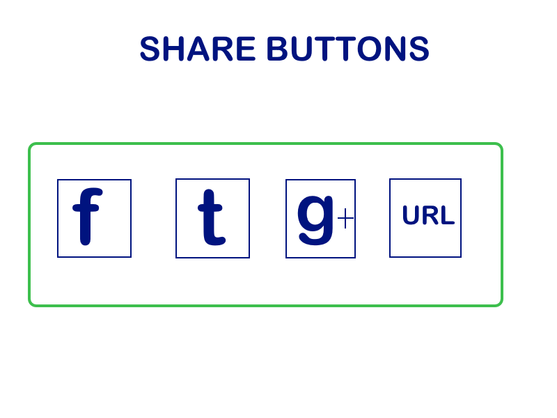
Things like photos, videos are all helpful to people who want to spread the word about our product or site and take feedback.
Fundamental 6: Have a Call-to-action
If we are trying to get visitors to do something, then better make it clear what we want them to do. The call-to-action could be – Subscribe to our newsletter, comment on our blog post, help our organization by Donating or Sponsoring, hire us, or buy our product.
There is an idea I read recently from social psychology called Reciprocity. It says – “If you give people something that’s useful to them, they’ll be more likely to be nice, and give something back to you.”By providing a website that allows them to find the right information that they needquickly, easily, without hype and without pestering them, we make it morelikely that they will react positively when we ask them for a favor in return.

Don’t expect people to fill out those long forms and give their email address, home address, and phone number just for showing them some basic information. They will need to feel that there is real value for them in sharing those details with us or making a purchase, which means – our site’s content specially FORMS must really be so genuine, short and helpful that it stays in their mind for a while before they make a decision!
Fundamental 7: About Us is a TRUST page
One important detailed page that we really should put on your website and also link from our navigation menu is the About Us page. No other page does more for establishing user’s’ trust in what we offer.
In fact, the About Us page might as well be called the, Can I Trust You page. About Us page is the best location to provide the details that will help users to trust us, do business with. Yes, please note: like all the other detail pages on website, the content here should be truthful and open.
“Tell users your location, let them know who you are, including contact details with a link to a Contact Us Form, but it’s much better to provide an email address and phone number. Give users some brief history, how long you have been in business, and what makes you good at what you do.”
If providing a service to clients, mention some testimonials, mention your business’s size and other important facts and links/URL’s to your work. Live examples of your product, project or whatever your service may be speak about your quality of work.
As a conclusion, if we keep our User Interface design simple, consistent, and standard, we’ll go a long way towards creating a great experience for our users. We need to make sure all of our content is there for a reason and that we use the minimum amount of text necessary, short words, short paragraphs, short pages easy to understand language and most important being truthful and open!
This is my theory which I strongly believe in – “Above all, Users are humans first, they are people who you build genuine relationship with and that is PRIMARY! Those people trust you, love your work and later bring you business or become your clients in future is SECONDARY!”
There are many more UI principles out there, so yes, please include them in your comments, and let’s enrich our library of thoughts!! Keep creating some fantastic and fresh interfaces! Be AWESOME!
Hi, I am a Web Developer, SEO Expert, Digital Marketing Analyst, and Co-Founder of LadyBird InfoTech – Austin’s Digital Marketing Agency. A Web Developer at the inventive intersection of Technology and Marketing. I enable my clients to be successful in their business by bringing value through their digital investments. I partner with my clients on how to leverage SEO, Optimizing Landing pages, implementing best practices for responsive Web development, Search Engine Marketing and other Digital marketing methodologies –to improve overall Brand Recognition, Search Ranking, Customer engagement, conversion and overall purchase funnel.
About us and this blog
We are a digital marketing company with a focus on helping our customers achieve great results across several key areas.
Request a free quote
We offer professional SEO services that help websites increase their organic search score drastically in order to compete for the highest rankings even when it comes to highly competitive keywords.
Subscribe to our newsletter!


Recent Posts
- The 8 Pillars of Social Media Marketing January 15, 2019
- Data Talks And Tells Interesting Stories! February 27, 2018
- Get your HTTPS on – Deadline July 2018 February 20, 2018