Web/UI design is much more than just arranging together some images and content in a layout. To design a visually appealing interface is to create a smooth flowing structure of your content which is simple, functional and delighting to the human eye.
You have less than 3 seconds to keep a user on your website. How will you manage to grab their attention? Your site needs to provide all of the above values as clearly and smoothly as possible which makes your site navigation a breeze!
I have tried to enlist the top 10 best practices for Web UI design.
- Simple and visible Navbars, keep it neat:
As the user scans through the webpage with their eyes trying to navigate your webpage, a simple clear navigation is a first positive experience. As the user scans through the webpage with their eyes trying to navigate your webpage, a simple clear navigation is a first positive experience. Similarities in color, size, spacing, and placement of icons at the same level of navigation. Interactive behavior of the icons keeps the user’s interest in the page like the change in font /color when hovered. Too many nav tabs?? Instead create drop down menus. Keeping the navbar small with just 4-6 icons/tabs. It is a good idea to let the drop downs roll out of the main nav when hovered.
2. The Image – Background Relationship:
Content still remains the vital element of any webpage. having said that, we cannot deny that Images conquer the look and feel. With that in mind, if the layout of the images is thought of carefully, images can be a delightful experience to the user’s eye. Whereas,an array of images just populated throughout the page confuses the user. Considering few tricks on the image placement can help you achieve the desired outcome. While keeping the rest of the page in a lighter background, the image can very well stand out bright and sharp over it. Another way of achieving the same ideas as above could be if the background goes blur and the image goes sharper and brighter. This surely lays all focus on the image.
The idea of overlaying the Image with a darker tone filter to let the Caption or Heading stand out works wonders. Ever tried writing text on an image, its the most difficult and confusing task but can produce delightful visuals if done the right way.
3. Clarify relationship:
Random images over the interface put user in a dilemma, where to follow? Relationship between images and the content makes perfect sense. Always adding labels close to figures gives complete information.
4. White space isn’t bad:
Too much white space, looks monotonous. Occupied all over, its Clutter! White space is another aspect which is usually overlooked. Proper use of white space eliminates waste in your interface. White space is not bad, extra space improves readability. Compare these two interfaces of Yahoo and Google. Absorbing too much extra information just makes it harder for the user to interact with the page. By being realistic about what the user actually wants, Google’s design encourages more effective interaction. The amount of strain an interface design creates with too much information is called “cognitive load”.
Users visiting your webpage for the first time cannot absorb too much information and may not even stay on page to grasp it at all.
5. Please keep forms short:
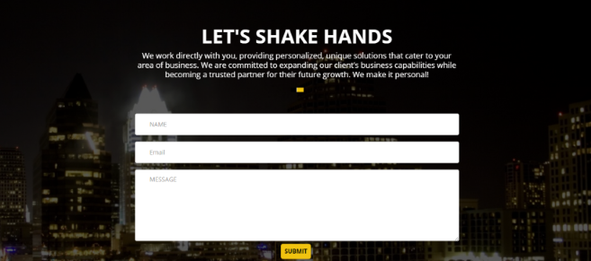
Too lengthy forms can discourage users to fill in completely. It is nice to keep your contact forms short and precise with just few fields of first name, last name and email address. There is a huge difference in being found and being contacted. So, keep it short.
6. Grouping:
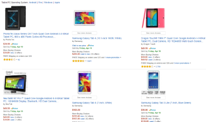
While users don’t need to memorize the categories, grouping the content on the category-level adds visual hierarchy to the interface. you could chunk relevant information and group them together to make it easier for User’s mind to process and remember. A very good example here is of Amazon. A large amount of products are presented, but users don’t feel overstimulated. Instead, the grouping in the interface lets the user process all the information and select on the one which interests them most.
7. Buttons and links:

Whether its on the desktop or tablet or even mobile devices, buttons and links are vital. You can guide the user’s attention more on buttons by contrasting them with darker tones. With the main site being on a lighter color theme it perfectly relates to darker tones of buttons specially on small devices where there is very less scope for actual reading. Information flows through buttons and links specially when you are browsing on your cell phone? isn’t it? It could be misleading if all the buttons are not similar or have different look and feel on other pages of the same interface. so, follow the same visual for all button throughout.
8. Colors and Patterns:

Color theory in web design is more than just the icing on the cake. It can evoke specific moods. While planning for the interface, after content, images and other resources, the first thing which comes to mind is the Color palette. Warm Colors – Reds, oranges, yellows. These tend to be invigorating, energizing, or otherwise aggressive. Cool Colors – Greens, blues, purples. These lean closer towards relaxing, calming, subduing, and passivity. It mainly depends upon the subject and the mood of the interface, but you could not go wrong if you consider using warm and cool colors together. Well, I agree they are clashing colors but they tend to please user’s eye when together and tend to be soothing! Using contrasts is a vital technique to grasp, as it can help set the user’s focus, affect their mood, and give your site its own unique style. When Blues come together with yellow tones, it is very impressive. Again, a cooler shade tends to calm down the warm colors and vice versa.
9. Typography:

There is no doubt about it – typography and the fonts we choose have a huge impact on our interface including readability, mood, clarity and an overall user experience .To do our job perfect as Web designers, we should consider and understand the different principles of typography that create a pleasing design, in order to properly portray the vision and mood of the interface being designing.Some of the top recommended fonts from Google Web Fonts : Open sans, Josefin Slab, Arvo, lato, Vollkorn, Abril Fatface, Ubuntu.
10. Last but not the least at all. Build it responsive:
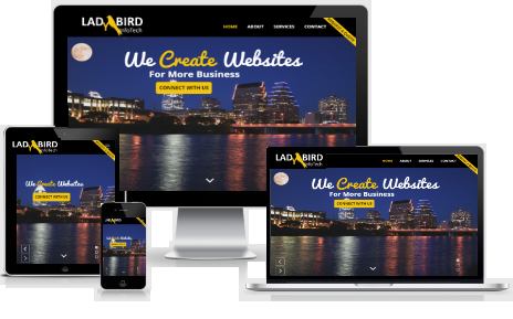
With traffic shifting towards mobile phone use, it is vital to design the interface responsive. We actually should consider designing and developing “Mobile first”. One cannot afford to have an online presence without a strong mobile interface! With Well, I totally agree not every design can be responsive. Aahh, it reminded me of an interface for which I almost spent overnight trying to go responsive but then I chose Graceful degradation and Progressive enhancement.Sometimes, I understand it becomes inevitable to let go of your favorite design just because it does not adjust on mobile devices! My personal favorites- Fluid grid layouts, and Media queries, they just work CHARM! Wow! I still want to share some more of my experiences for going “Responsive” but I guess I need to stick with the relevant UI design tips here. This is another full-fledged topic which i assure I will cover in my separate blog.It only takes users about 3 seconds to form an impression of your site.
To keep users engaged, your site needs to have an instant visual hierarchy that logically structures all of the elements we have discussed above.
We’ll explore the fundamentals of going all responsive in my next blogpost.Till then, keep creating some fantastic and fresh interfaces! Be AWEsome!
Hi, I am a Web Developer, SEO Expert, Digital Marketing Analyst, and Co-Founder of LadyBird InfoTech – Austin’s Digital Marketing Agency. A Web Developer at the inventive intersection of Technology and Marketing. I enable my clients to be successful in their business by bringing value through their digital investments. I partner with my clients on how to leverage SEO, Optimizing Landing pages, implementing best practices for responsive Web development, Search Engine Marketing and other Digital marketing methodologies –to improve overall Brand Recognition, Search Ranking, Customer engagement, conversion and overall purchase funnel.
About us and this blog
We are a digital marketing company with a focus on helping our customers achieve great results across several key areas.
Request a free quote
We offer professional SEO services that help websites increase their organic search score drastically in order to compete for the highest rankings even when it comes to highly competitive keywords.
Subscribe to our newsletter!


Recent Posts
- The 8 Pillars of Social Media Marketing January 15, 2019
- Data Talks And Tells Interesting Stories! February 27, 2018
- Get your HTTPS on – Deadline July 2018 February 20, 2018